Designing for accessibility.
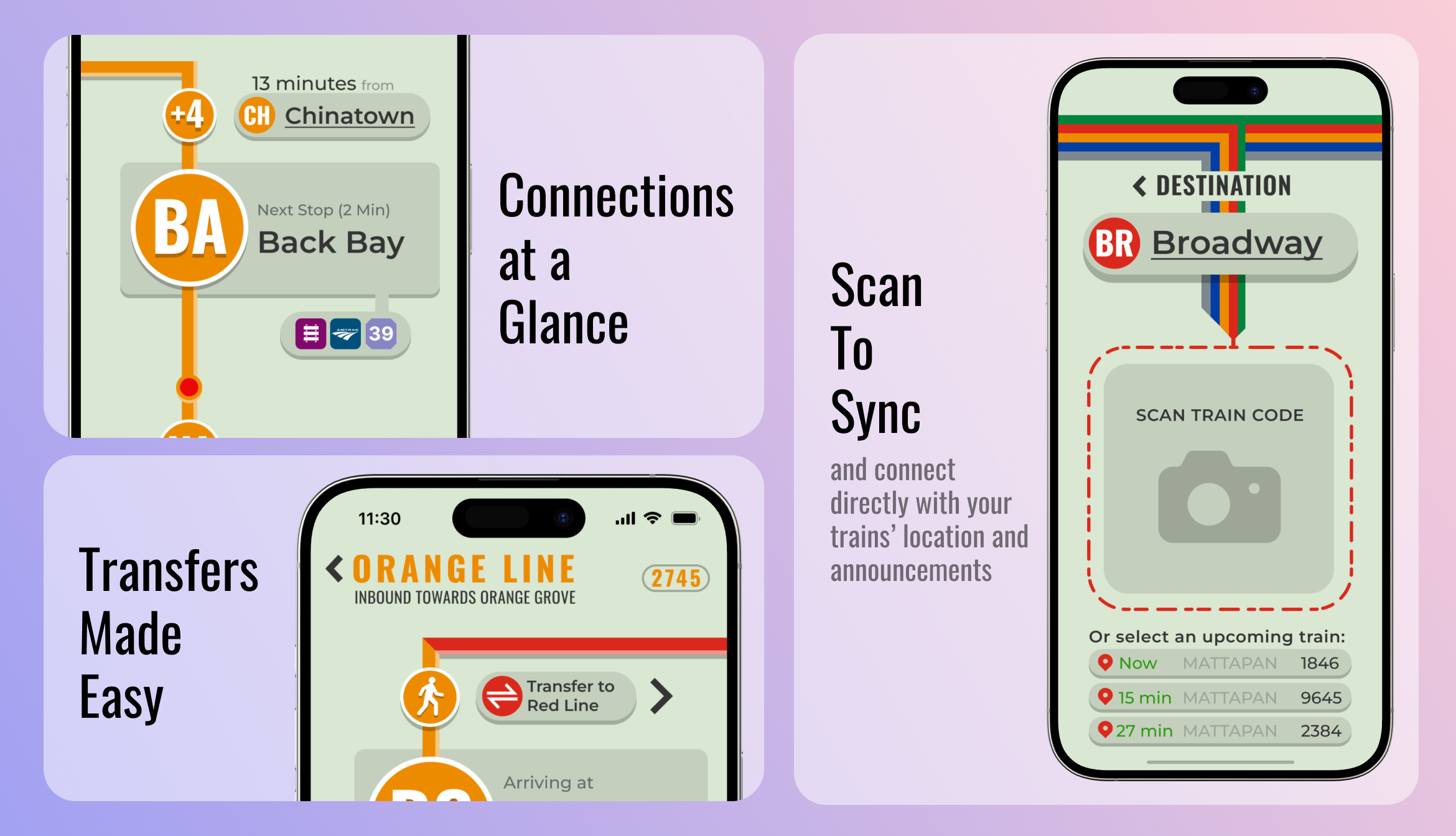
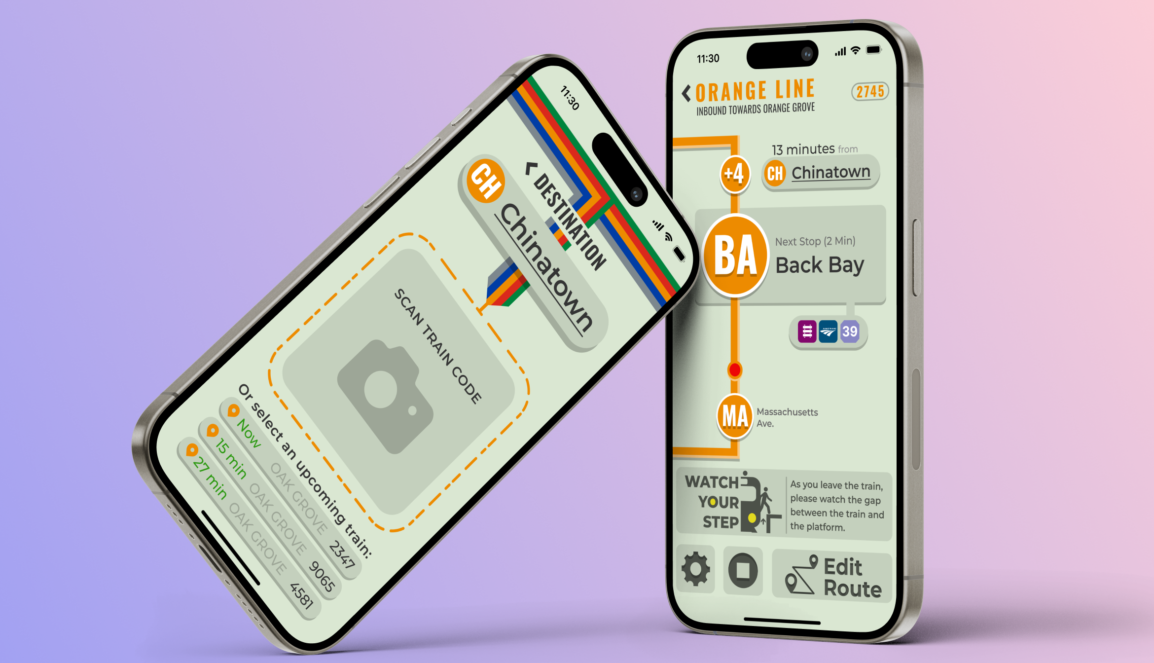
From the beginning, my goal was to create an app that truly prioritizes accessibility. Whether someone lives with visual or auditory impairments or simply doesn't speak the same language as most people in Boston, everyone deserves to have an equal opportunity to navigate the city's transit system with ease. To achieve this, I designed this app with many features that target accessibility. For example, the app includes settings for screen reader compatibility, an announcements section that relays your trains' spoken announcements to your phone screen, and multilingual support to assist non-English speakers in understanding important trip and safety information.
Existing tools fall short.
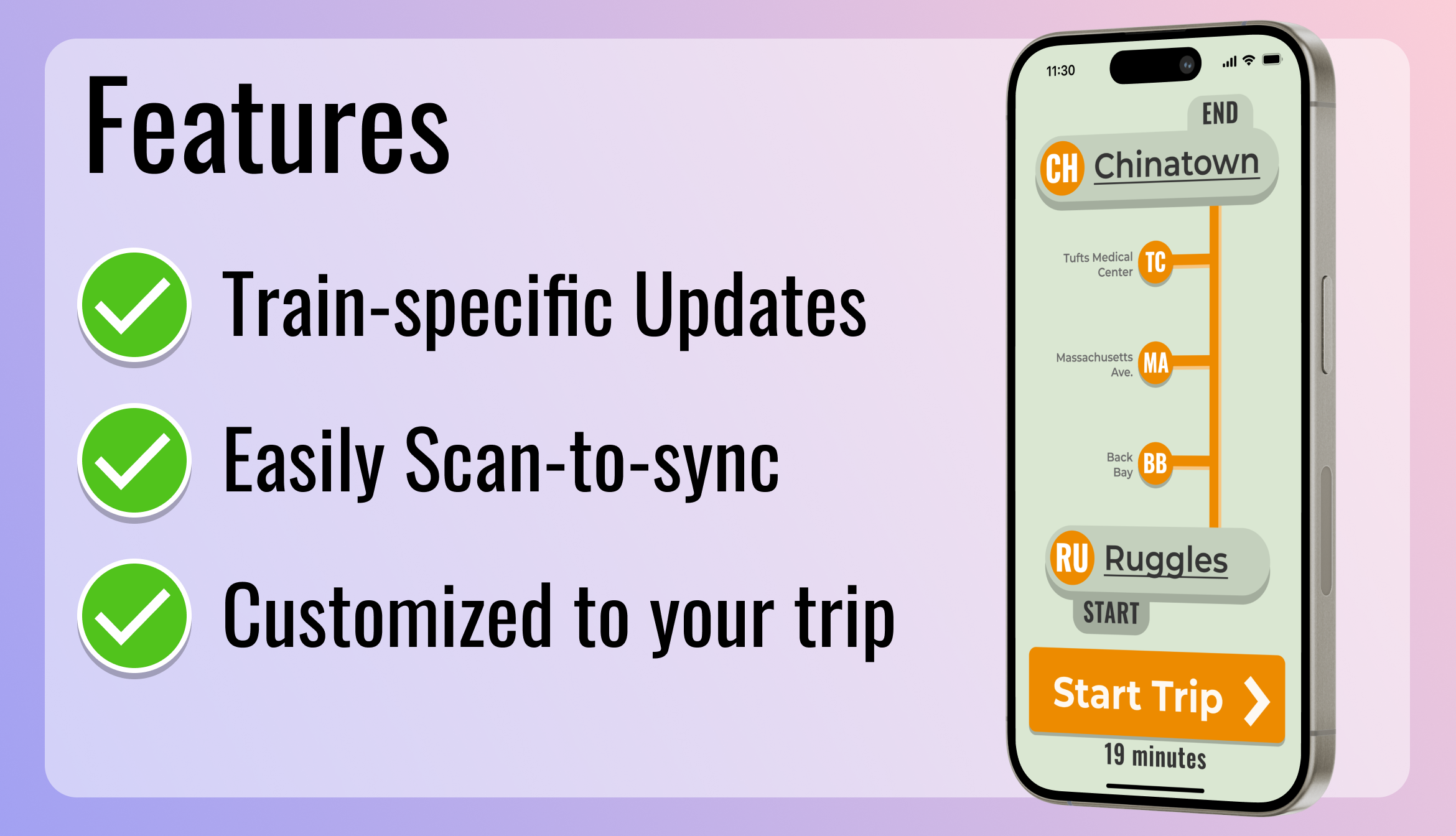
Navigating the underground with traditional tools like maps and station signs can be frustrating—they're often outdated, inconsistent, and lack real-time updates. Even modern apps like Apple and Google Maps aren't fully equipped for the intricacies of Boston's subway system, often missing key details and accurate underground tracking. These tools offer a basic overview, but they fall short when it comes to the specific needs of riders. My app is designed to connect directly to the train you are on, providing specific and relevant updates and announcements directly to your palm.
Color-coded and clear.
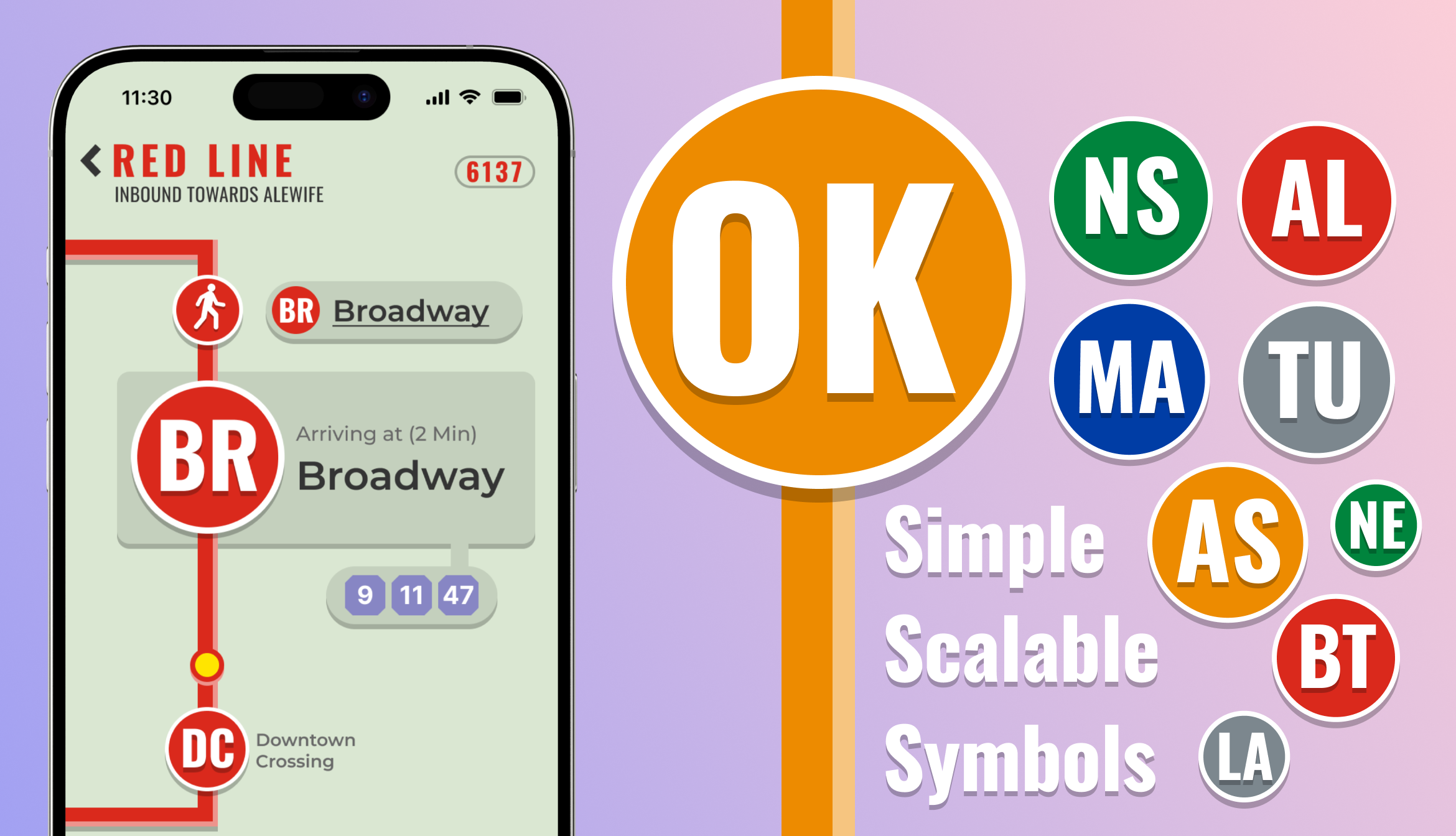
Lorem ipsum dolor sit amet, consectetur adipiscing elit, sed do eiusmod tempor incididunt ut labore et dolore magna aliqua. Ut enim ad minim veniam, quis nostrud exercitation ullamco laboris nisi ut aliquip ex ea commodo consequat. Duis aute irure dolor in reprehenderit in voluptate velit esse cillum dolore eu fugiat nulla pariatur.
Holding on to history.
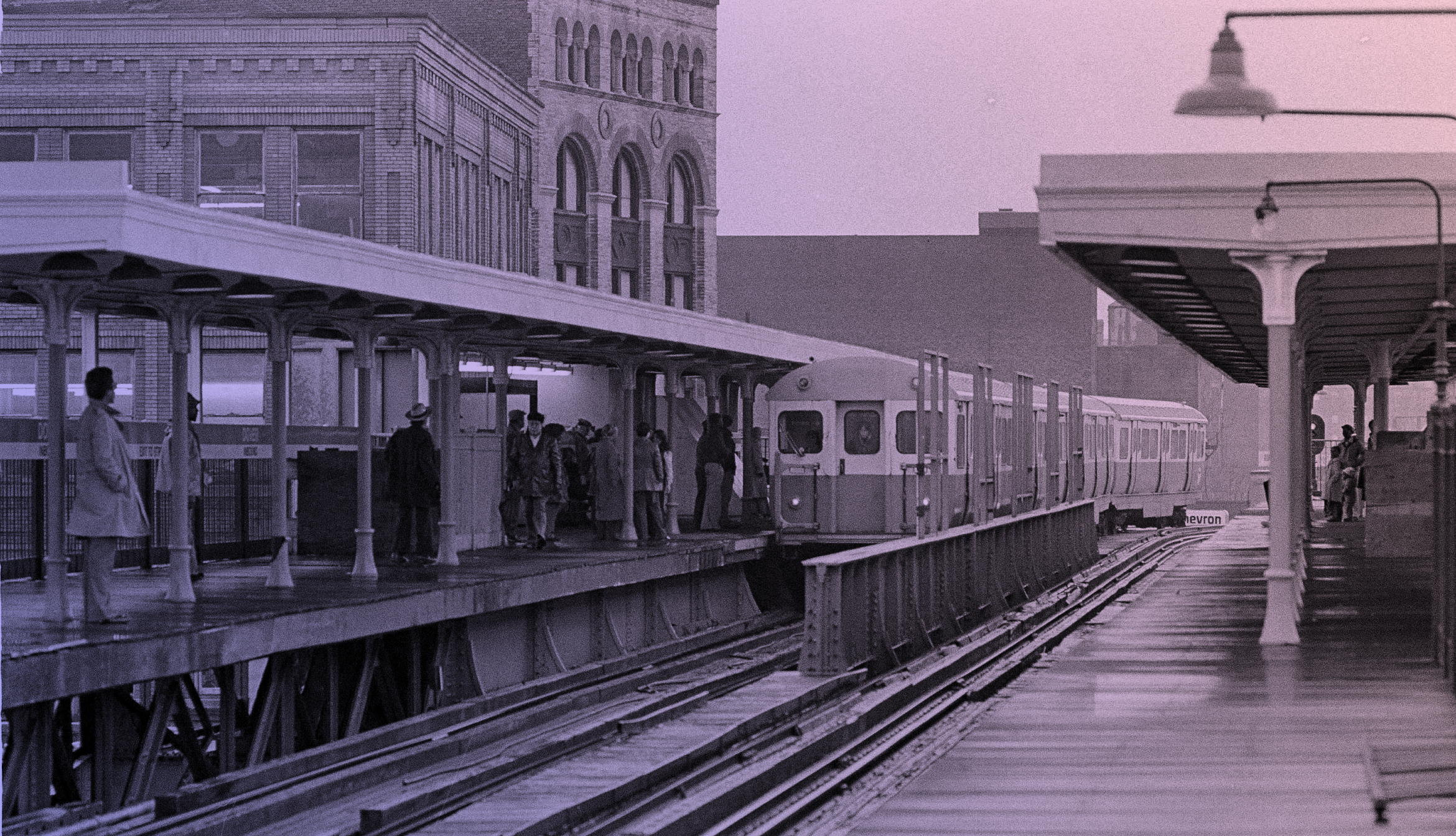
The Boston underground, part of the oldest subway system in America, carries a deep sense of history, from its vintage fonts to the iconic tile patterns that have been preserved over the decades. When designing this app, the goal was to honor the MBTA's rich past while ensuring it meets modern usability standards. The design incorporates solid, blocky text reminiscent of the original station signs, with colors and shapes that reflect the classic color palette and design language of the MBTA. This blend of historical and contemporary design aims to create a familiar yet fresh user experience that feels true to the Boston transit system's history. Balancing these elements was challenging, but the result is an app that feels both timeless and functional.
An app that minds the gaps.
Lorem ipsum dolor sit amet, consectetur adipiscing elit, sed do eiusmod tempor incididunt ut labore et dolore magna aliqua. Ut enim ad minim veniam, quis nostrud exercitation ullamco laboris nisi ut aliquip ex ea commodo consequat. Duis aute irure dolor in reprehenderit in voluptate velit esse cillum dolore eu fugiat nulla pariatur.
